Was the Front/Back Cover relevant?
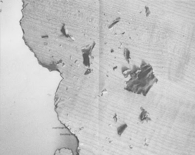
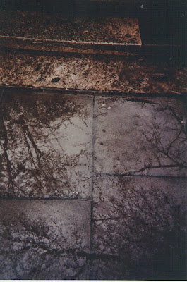
-Yes. The image is taken from one of my films which focused on the idea of the existence of trees, and what would life be without them. It was a favourite image of mine, which is cropped for the covers, however the full size image features within. The image is also the banner which runs across the top of my blog.
However, I can understand having not really known what this book was about, and the more personal level it has with myself, that this image may not seem to relate.
The Use of the Photos?
-Some are more direct than others. However, they all relate in someway to what the chapter/piece of writing is about. Having a mixture between the directness and indirectness of each of the photo's in connection to the writing is good, because the direct ones definitely give you a sense of relief. If they were all indirect to an outside audience, there would be little interest in trying to understand the book as a whole.
Hierarchy of Text of Chapter Pages?
The layout on the chapter divides is very important. The title features at the top of the page, and this is the most crucial element of the whole book-the 'what if's' 'had i's' etc. These are the crucial elements which as the creator, I want the reader to take on board.
Underneath this small detail at the bottom of the page are then the pages involved in this chapter, for example 'were no trees' these are the second most important elements of the book because it puts into place what to do with the subject title. It puts the titles into perspective, to then lead you on and think about your own questions, of what would be life like if.......
Other Pages Become An Image?
The pages with the writing which then follow the chapter divides, were mentioned as being something you just look at, and don't read.
I do agree with this, I purposely made the text small, as to make it insignificant, because the text is what I believe...in this place should be the readers own opinions. (so maybe I should have involved just black squares/blacked out words instead, so it made it clear the my thoughts are my thoughts, and everyone elses perspectives could be very different.)
So the fact you may glaze over the text and striked though text, is no issue at all. It is the chapter divides which are important.
Overlayering and Crossing Out of the Text
There is overlayering involved on the text, so the title/theme of what the piece of writing is about, is entwined and visible, to put into perspective what the piece of writing is about. I didn't want this to be separate from the rest of the text. It also breaks up the smallness of the text, and also sums up in a nutshell: trees / trees
so life with trees-life without. Without having to even read, just to see that the text has been struck through.
So maybe I could have even got away with just involving the title.
I crossed out the text, because the crossed out text is a duplicate of the text which appears before which isn't crossed out. It is crossed out in parts to emphasis what wouldn't exist if this object/thing didn't exist. If you then read what isn't crossed out, its funny, intriguing to understand. A really delicate little piece.
The Amount of White Space?
Gives space to breathe and think. I wanted it to signify the need for your own reflection. As a reader, if you were to have pages and pages continually after each other, full, and with information, then you just wouldn't stop and collect your thoughts. I think this was the most important area of my design. And just not to be scared of negative space.
Book Becomes an Object in Itself?
The nature of the book became to be like a beautiful thing in itself, which is true. I wanted it to be appreciated and thought about as a whole. The delicacy of the writing, and the imagery and the words are to be taken with care, as an object you own would be.
Could I have Just Focused on One Thing?
Yes, this was an option, and I tried it. I tried it with the book on with and without trees, and then perhaps the possibility of making a collective of books, each on an aspect that what would it be like if it didn't exist.
Although this really worked and would have been fine, I wanted in the end to produce more of a collective of subjects, all accumulated within one book. So this one book could create the impact, rather than a series of however many... though this would have been really good.
It is still something I could try.
