Julia Born/Thomas Buxo/Change Is Good/Peter Eno/Stephen Farrell/Hansie Van Halem/Made Thought/Laura Meseguer/mgmt. Design/Isabel Naegele/Sagmeister/Henrik Wygren/Eddie Opara/Radim Pesco/Claudia Siegel/Astrid Stavro/Frauke Stegmann/Studio Pip & Co/Yokoland/Alberto Vieceli
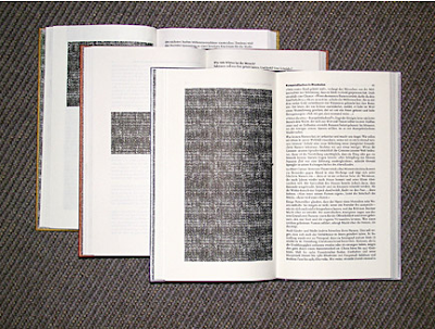
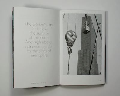
These are the names of some graphic designers who really struck my eye whilst flicking through the book: Area 2 (2008, Phaidon Press Ltd). Most of them struck me because of their use of typography.


Typography is a key way to communicate, as there is nothing more communicative than words. There are infinite ways to use typography, and these gave me a whole wealth of inspiration.
I discovered Kim Bouvy by accident whilst looking through Hansie Van Halem's Blog. I have an obsession with the type of work Kim Bouvy produces. Atmospheric, printed, simple, greyscale, photographic, typographic.... so so inspiring.


Tatiana Trouve.
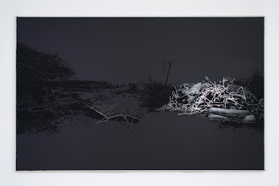
Trouve is currently exhibiting at the South London Gallery, and as soon as I saw her canvas's I was entranced. Tatiana Trouve is a fine example of where there are so many cross overs within art and design, she would probably describe herself as a Fine Artist, however I felt her pieces were extremely graphic.
The element which struck me more than anything, was the simplicity of the colour scheme, but the sophistication in the use of medium.

4. Untitled , From the Series Remanence, 2010, paper on canvas, pastel, graphite, aluminium, 240 x 153 cm.
My favourite piece: 3. Untitled, from the series Remanence, 2010, was to me, incredible because of the black-on-black. It was so interesting, how different blacks in different mediums create such an incredible contrast in surface texture, and therefore 'colour' and definition. She used paper on canvas, charcoal, graphite, aluminium, and varnish. The only element which wasn't black, was the aluminium, which was applied so thoughtfully and carefully, to highlight, and also I think, to bring out the qualities of the other mediums. My favourite contrast was the varnish against the matt background. Was beautiful.
