29 November 2010

Conclusion For Cut Up Pt. 1

Looking back to what I started with at the beginning of the project, I would never have envisioned that two weeks in the future I would have the outcomes which I have.

I started with a paragraph of writing which made no sense at all, however the end result couldn't look further removed.

The vital turning point for this project for me, was the interpretation of the writing into an image. I represented it by using a square - to symbolise the nonexistence of the subjects in the writing.

This aspect is what stayed with me, as I tried various ways of communicating this.
So though this was primarily a project evolving around typography, I have turned out with no typography at all. (Except for the single word printed on the pages of the booklet)

I developed my idea of representing nothing by using photography.
I had the concept that by photographing mundane, normal, everyday places/things/objects, that in theory, they are so normal they wouldn't be noticed and therefore nonexistent.

So my subjects were taken at night time, to make it more atmospheric and unnoticeable, the subjects were trees, building sites and blocks of flats.

From these photo's I made a booklet through scanning, printing and photocopying, and then rescanning, reprinting, and re-photocopying.

The final stage was to print a small word onto each left hand page, to set in place my idea of nothing.


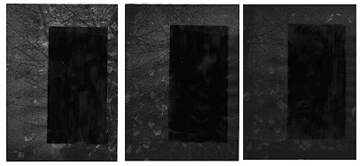
The second part to my final piece were a series of pieces made from an enlarged photocopy of the front cover of my booklet, with a square of acrylic painted onto each one in the same place.
This was my second interpretation to go alongside my booklet on the theme of nothing. Having this alternative adds a second dimension. Allowing this to be easily viewed, while the book is more of an object to be picked up and held.

I really like the final outcomes due to the journey they took from the start to the end.

Final Series

To go along with my booklet, I framed this series of prints with acrylic.
I was really happy with how both the concept and these pieces came out, so I feel including them as the final result is a good idea.
It adds an extra element to the booklet, whilst still being relevant.

Though its three of the same image, they are all varied as they go up in tone.
Having this really subtle difference really brings to life the black acrylic square.


28 November 2010

Final Booklet Inside Pages

There is a very subtle addition to these inside pages, that being a word on each page which evolves around the meaning of nonexistence.
I put the photocopied page back through the printer so the writing got printed directly on top.


Nonexistent

Illusory

Absent

I added this very small detail because I felt this would then put into place my theory of representing nothing, through mundane normality.


27 November 2010

Black Noise


I found a selection of artist books called Black Noise, and this image above is a front cover from one of the books. When I saw it, it really reminded me of my idea's of cutting out the squares on my booklets to allow the page to show through from underneath. However, the difference here, they have blacked out the area on the image instead. I think it looks like a reverse frame. I really like this idea, so Im going to try it with some photocopies taken from my own booklet.


Originals


I really like the blurry quality of the originals as they are, I think they are so atmospheric. I chose these images due to my liking of the original.


With Acrylic Paint


I am more happy with the outcome of the image above than below, I think there is the possibility of this idea becoming my final outcome. In real life, the black on the dark photocopies is really striking.

I think this concept of blocking out completely really works with the concept of something being non existent.


26 November 2010

Edit to Booklet


I cut out the white square to allow the image on the next page show through.
I really like how this has scanned.
I like the mix between the zoomed in area of the photo, combined with the actual sized image showing through underneath.
Its the same image showing on both the pages, but just the photo's are of different sizes, making a really interesting looking contrast.

First Mock Up of Book

Front and Back Cover Image


Page 2-3


Page 4-5


Pages 6-7


Page 8-9


Page 10-11

24 November 2010

Photography Ideas

Photo my idea of a representation of 'nothing'

I could either photograph insignificant places, places which are so mundane they are practically invisible.

Or

I could take my text, the subjects which are named in my text, and find a way of representing them as the non existent item.

For example:
Three Legged Chair: Picture of a park bench/seat/sofa/etc which has a number of legs that isn't three.

People Marching: The forecourt of Buckingham Palace/Trafalgar Square where there are not a million people marching.

Regal/Posh: Run down area/Empty dark street/Homeless/Litter/Graffiti

Birds: Steps of London Bank (seen in Mary Poppins!) with no birds/A tree/Pylon with no birds

Open Door: Overgrown House Front/Locked Up Building/Boarded up House

Bible: Juxtapose a regular book in place of where the bible sits on the stand in a church

Create six different outcomes to be apart of a series. This series could be posters made separately, or they could accumulate to be a part of a printed zine/book.

Project Development

After the various experimentations and research into inspiring designers, I need to now take an aspect of my project on further.

The aspect of my project which I feel has real depth to it is the aspect of drawing my piece of writing, and the way I interpreted it.

The way I interpreted it was through the meaning of the text itself, the text describing what doesnt exist.

I initially represented this through a square on an A1 page.

I like the idea of taking this idea on further through the medium of photography, the style of photography as seen in the research I have done on the post entitled 'Awe'.

Really atmospheric, dark, blurry, grainy and organic. A depiction of real life.

Awe

Dust and Shadow Zine by Charlie Duck
I really love simplicity
The simplicity totally compliments my concept for the theory - of nothingness
There couldn't be much less on this front cover, I love it


Again - simplicity which I love so much
What strikes me here is the mundanity of what is featured. Things you dont notice.
Again really highlighting my theory for invisibility of the everyday.


Kim Bouvy's Beautiful Book
Love the dramatic, dark imagery
Love this sort of intense photography, think I have a real fondness for imagery of places and buildings! Seems to be what I have so far been attracted to...


Again, love the photography and layouts
Clean and nice to look at. Inspiring, without being too noticeable.


Love the juxtaposition between image and type.
Though I probably wouldn't have been brave enough to use colour and if I had done it, it would be in greyscale. Just because I think greyscale is so much more appealing and beautiful


Really love his work, especially the page of the book above.
Really really really love the composition of the text and the typeface, with the simple addition of the B&W photo.
Really delicate looking

Zine Influenced by Sam Winston


20 November 2010

Writing in Code

There is no three legged chair

there isnt a million people marching

there is nothing regal or posh

there are no birds

Coding


Pattern taken from fabric. Small selections chosen through a view finder, 26 times for 26 characters of the alphabet.

Idea for the use of squares taken from my drawing of writing.

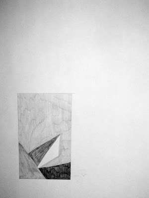
Drawing of Writing

posh/regal


This was a tricky concept - to draw a piece of writing.

From my piece of writing (there are no...etc..) i decided to take the content/meaning of the paragraph to translate into an image, instead of the look of the piece of writing on the surface.

As the paragraph was written about what isn't there, I wanted to draw a box of nothing. However, I decided that to reflect my piece of writing more, then I would represent an area of what there isn't, within the box.

I used the sentence which involved the words regal and posh. I associate jewels, expense and diamonds with those words, so I decided to do a small segment of a diamond within the box.

This is my representation of my writing, I think this could be developed further into a series, with each of the different aspects of whats not involved, represented in the box.

three legged chair

people marching

birds

open door

bible

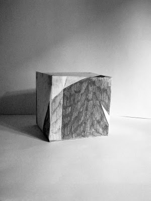
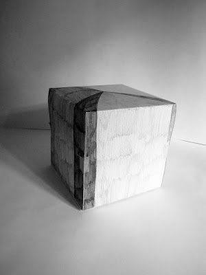
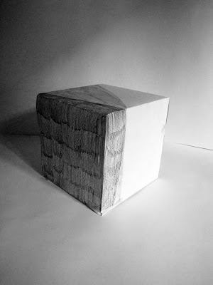
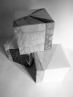
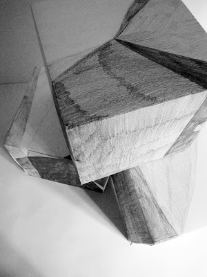
I took the concept of drawing a piece of writing on further by translating my 2D idea into 3D.
I had the idea of making six cubes, each with the pattern of the initial drawing on around the outside of it.

This is the first representation I made - from the first image at the top of post.
(posh/regal)

This is my second representation - second image down on post.
(three legged chair)

The third representation - third image down on post
(people marching)


A composition of the three. You get the idea...