1 April 2011

Final Evaluation

My Project brief was based around the exploration into the butterfly effect. I initially researched the theories and history surrounding it, which was interesting, but it was the research in the way of fictional books and films that ultimately influenced my project outcome. Reading the book ‘The Tale of Forking Paths’ by Jorges Luis Borges, was the best piece of research I found. This story, though it being fictional, related to the exploration of ‘what if’.

The feeling I got from the story made me realise the beauty in written word, because ultimately, from writing, the author has the power to implant a vision or thought into the readers head. So although the visuals were obviously going to be very important for the final product, I felt it was more important to start off with the writing. I wanted to write to be a trigger for people to then provoke their own thoughts. Before reading the book, I assumed my outcome would be personal. However, I soon came to realise my audience was not for myself at all.

I was unsure whether to use image or not, or whether to use pure typography in my final publication. However after many experiments, I decided to stick with my plan and use photography alongside text. Photography I felt was the most appropriate medium, as at the click of a button, you have captured a split second in time (the name of my project). I wanted to double expose onto the film, however this didn’t work on a disposable camera which was a shame - despite my research. But the quality of the image was exactly as I wanted, very real, grainy and atmospheric. The major contextual references which were a big part of my project, were John Stezaker, and the exhibition of his at the Whitechapel Art Gallery, Adam Broomberg and Oliver Chanarin, who opened my eyes to the theory of removing a part of an image to make it non existent (as did Stazaker), which then put my idea of ‘with/out’ into play. My trip to the Tate Bookshop, the Pick Me Up exhibition, and Nigel Peake were all important, mostly for looking into publications and design layouts.

Throughout my project I maintained my time management through keeping a diary, I am an organised person when it comes to deadlines, and so making sure my book was sent off in time was no problem.

If I could re-do an aspect, it would be on a comment I received from a critique which was: what if I just focused on one aspect in my book? Much like my work at the start of my project where I only focused on trees. If I could change something, then it would be to create a series of different books, each focusing on a different ‘with/out’.

From this project, I have definitely developed in my purpose for what i’m creating - and the importance of the audience. Though this changed along the way, I am definitely at a stage now where I can identify my intentions and purposes, this in itself will be something I keep with me in future projects.

Additional Exhibition Pieces IV [Final]


Following on from my previous idea for an additional exhibition piece, I made a book myself with the exact same layout as my final book.

I wanted to keep it consistent, precise, and tidy.

So I printed off my format on indesign, and printed the front cover onto glossy silk paper so that both the covers are identical.

I applied each of the categories through the book: what if/had i/if there/should have and I wrote a small intro on the front inside page, explaining I want people to write in this book.

For the front cover, the only part I changed was the bottom right - instead of 'kate smallshaw', I changed it to 'you'.

I think this book is a much better piece to run along side as opposed to the very large A3 posters which I was initially thinking. Its much more personal, as i'm sure some of the pieces people would want to write, would be personal, and not something which would want to be displayed insensitively.

Additional Exhibition Pieces III


Here is my idea from before, however printed A3 and with the additional spaces for the public to fill in their own thoughts.

I am extremely unsure about this. I don't think this will work visually at all.

It is a too vaster contrast between the tiny book and then this accumulation of posters which make up a space of just over A1 in total...

I like the idea of having an interactive element, because this book was made to intrigue and provoke thoughts to everyone, so me finding out what other people relate to this subject would be fascinating for myself. And it will help to reinforce the need for people to take this concept in a personal way.

Maybe I shall make a comments book instead???
Where people apply their thoughts inside a book, instead of writing on posters on the wall. This will then leave me with something special at the end, providing people aren't shy to write inside.

Additional Exhibition Pieces II


New Aim: To keep the posters extremely minimal and directly inkeeping with what the book is like, plus the previous experiments which went towards the creation of the book.

I think these, printed off on A3, would work much better in relating to my book.

However, what could be good and would be good for finding different responses to the subjects, would be to make it interactive.

-To have additional lines under the titles for people at the exhibition to fill in their own thoughts on the different titles...

Additional Exhibition Pieces I


These pieces are influenced by Mario Hugo.
I used my images which were combined in the style of Stazaker which I made in the early, early stages, then applied text over the top.

I really dislike these - They are not at all in keeping with the book. Much too dark and claustrophobic.

Additional Exhibition Pieces?

I feel for the purpose of the exhibition, I need to have a separate piece along side my book. Preferably a poster or a series of posters.

Evolving round the initial:
what if
had i
if there
should have

.......


Bryan Gysin Influence Experiment.


'iemt'

together. that is future, with in. hasn't will plan, history. or
late, t i m e forgotten what our work,
organise because already be haven't great the thinking
though means things to m o v e m e n t. m e a n s fate open. predict
having shops by having we
p r e - chance. may means have a when have
m e d i t a t e d we may our p r e s e n t the yet.
we by yet, exactly. really we lives we we just also

that not but directly to live
back yet when to to or can
live along to happened or run a lives. wake

time time, and
have it and
times thinking

go can't course been. be school
don't live of for to time h a v i n g when
because we means up, may all
time happened know order precisely


I took my 'time' writing, cut out all the individual words and then turned them over so I couldn't see them.

I then kept the format the same as the original text - for example, same words in a line and same lines in a paragraph.
Re-essembling my piece on time has created some really amazing sentences.
This cut up technique could have been used instead of the strike through text for the 'without' part.
Or it could be used for some alternative pieces which I can sell on the private view.

30 March 2011

Last Minute Extra Research

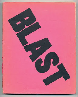
Blast Manifesto (The Vorticists)

A publication of Pure writing. An example where art and writing have joined together, much like my own desire for my own outcomes. This magazine is a manifesto, and although beautiful to look at, there is no image. They have solved that puzzle of making something look good without a typical image inside.

The composition of the text is what is important, it is the layout of the words on the inside which make you want to read the content. The layout within is never exactly the same, but still all ties together wonderfully. Different indentations and alignments. It is poetic but at the same time terrorising.


Tomato - Mmm Skyscraper I Love You

Excellent example of a visually stunning piece where the writing is the artwork.

Text As Image.

Though this is extremely layered, you can still pick out small parts, and the way the writing is illustrated comliments the scene in which they were trying to create (their experienced of NYC)

It would have been interesting to try this in relation to my own writing.

Art and Language

Conceptual art movement accumulated within journal 'Art Language'.

Moving from the usual image based to more theoretical language and written based art. This is quite relevant to me because of my love for the written word. I think words in themselves are incredibly powerful and are their own art form. This movement is designed for the beauty of language.

Bryan Gysin

Artist, Poet,
Surrealist, Dadaist

I am fascinated by Gysin because of the 'Cut Up' technique he used regularly. He would cut up existing newspaper articles, or other pieces of writing and then reassemble them to make a whole new poem or prose. And strangely enough, the pieces of writing would strangely work, turning the original piece into a whole new meaning.

This is beautiful and a technique I really must look into.

mtei

together. that is future, with in. hasn't will plan, history. or
late, t i m e forgotten what our work,
organise because already be haven't great the thinking
though means things to m o v e m e n t. m e a n s fate open. predict
having shops by having we
p r e - chance. may means have a when have
m e d i t a t e d we may our p r e s e n t the yet.
we by yet, exactly. really we lives we we just also

that not but directly to live
back yet when to to or can
live along to happened or run a lives. wake

time time, and
have it and
times thinking

go can't course been. be school
don't live of for to time h a v i n g when
because we means up, may all
time happened know order precisely

29 March 2011

Final Crit Comments 28/3/11

Was the Front/Back Cover relevant?
-Yes. The image is taken from one of my films which focused on the idea of the existence of trees, and what would life be without them. It was a favourite image of mine, which is cropped for the covers, however the full size image features within. The image is also the banner which runs across the top of my blog.

However, I can understand having not really known what this book was about, and the more personal level it has with myself, that this image may not seem to relate.

The Use of the Photos?
-Some are more direct than others. However, they all relate in someway to what the chapter/piece of writing is about. Having a mixture between the directness and indirectness of each of the photo's in connection to the writing is good, because the direct ones definitely give you a sense of relief. If they were all indirect to an outside audience, there would be little interest in trying to understand the book as a whole.

Hierarchy of Text of Chapter Pages?
The layout on the chapter divides is very important. The title features at the top of the page, and this is the most crucial element of the whole book-the 'what if's' 'had i's' etc. These are the crucial elements which as the creator, I want the reader to take on board.

Underneath this small detail at the bottom of the page are then the pages involved in this chapter, for example 'were no trees' these are the second most important elements of the book because it puts into place what to do with the subject title. It puts the titles into perspective, to then lead you on and think about your own questions, of what would be life like if.......

Other Pages Become An Image?
The pages with the writing which then follow the chapter divides, were mentioned as being something you just look at, and don't read.
I do agree with this, I purposely made the text small, as to make it insignificant, because the text is what I believe...in this place should be the readers own opinions. (so maybe I should have involved just black squares/blacked out words instead, so it made it clear the my thoughts are my thoughts, and everyone elses perspectives could be very different.)

So the fact you may glaze over the text and striked though text, is no issue at all. It is the chapter divides which are important.

Overlayering and Crossing Out of the Text
There is overlayering involved on the text, so the title/theme of what the piece of writing is about, is entwined and visible, to put into perspective what the piece of writing is about. I didn't want this to be separate from the rest of the text. It also breaks up the smallness of the text, and also sums up in a nutshell: trees / trees

so life with trees-life without. Without having to even read, just to see that the text has been struck through.

So maybe I could have even got away with just involving the title.

I crossed out the text, because the crossed out text is a duplicate of the text which appears before which isn't crossed out. It is crossed out in parts to emphasis what wouldn't exist if this object/thing didn't exist. If you then read what isn't crossed out, its funny, intriguing to understand. A really delicate little piece.

The Amount of White Space?
Gives space to breathe and think. I wanted it to signify the need for your own reflection. As a reader, if you were to have pages and pages continually after each other, full, and with information, then you just wouldn't stop and collect your thoughts. I think this was the most important area of my design. And just not to be scared of negative space.

Book Becomes an Object in Itself?
The nature of the book became to be like a beautiful thing in itself, which is true. I wanted it to be appreciated and thought about as a whole. The delicacy of the writing, and the imagery and the words are to be taken with care, as an object you own would be.

Could I have Just Focused on One Thing?
Yes, this was an option, and I tried it. I tried it with the book on with and without trees, and then perhaps the possibility of making a collective of books, each on an aspect that what would it be like if it didn't exist.

Although this really worked and would have been fine, I wanted in the end to produce more of a collective of subjects, all accumulated within one book. So this one book could create the impact, rather than a series of however many... though this would have been really good.

It is still something I could try.

21 March 2011

Officially Published My First Book!


Soft Cover Colour 5"x8" Black & White Insides
52 Pages
£6

My Purpose in Making My Book.

I made this book, stemmed from my own interest in the Butterfly effect, in order to provoke thought to others, of all ages - young and old.

I wanted this book to be neutral, not that any sides could be taken with this specific subject, however I wanted this book to be something which is just in the background... A book which can be looked upon, however the readers own personal thoughts will override my own writing, and my own thoughts.

This book is meant for anyone at any age, because throughout life, however old you are, you always question what hasn't happened, or what could. Always wanting to know the unknown. The feedback throughout the ages would possibly be different as it went along, young people's concerns or questions are likely to be remarkably different to an adults question.

I am hoping through this book, the readers will start to think about the world from a new perspective. Perhaps what the world would be like if their things that they couldn't live without, didn't exist.


Memory Page Spreads Experiments


Tree Inside Spreads